Wow. If you haven’t seen Isabella Rossellini’s Green Porno yet, then you’re purposefully starving yourself from good watching.
Big post coming Monday. Keep your peepers pealed.


with Christopher Heavener
Wow. If you haven’t seen Isabella Rossellini’s Green Porno yet, then you’re purposefully starving yourself from good watching.
Big post coming Monday. Keep your peepers pealed.

Check out Jersey-based renaissance woman Kristen Lepore. I could take or leave the illustrations, but her demo reel is something to be remembered.

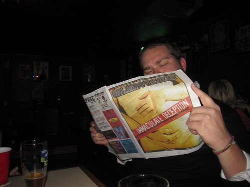
Author Zoe Heller comes back with a tragicomic tale of a family in turmoil after the patriarch falls after suffering a stroke. Might be a good story, but more importantly, what’s going on with the cover?
Well, you can’t really go wrong with arranging religious and idealogical imagery in some kind of organized chaos. Well done, nameless HarperCollins graphic designer.

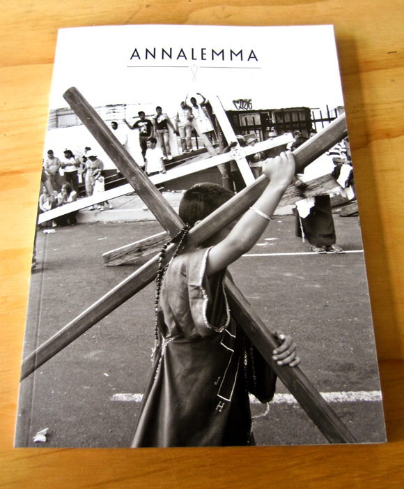
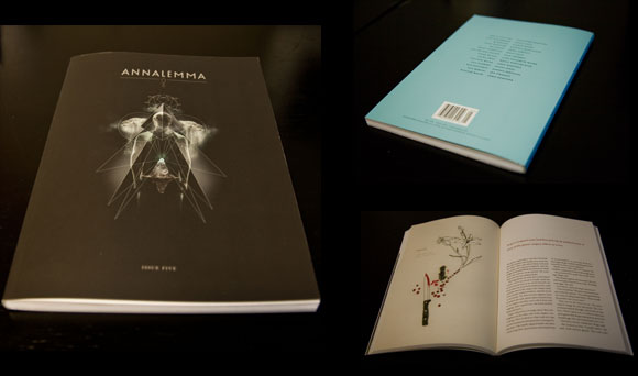
To celebrate the fact that I have an overabundance of boxes in my closet, Annalemma Issue #3 is on sale for half the cover price. Click here to check it out. While you’re there, be sure to check out issue #4, which is no longer on pre-order and is shipping promptly.
Stories & Songs was really fun last Friday, I’ll post pics tomorrow
Young Brother from Northern Lights on Vimeo.
Here’s a jam called “The Mayor” from the Young Bro show that took place not one week ago. I gotta remember to wear some some contrasting colors next time. I look like a disembodied head and a pair of arms jamming on the bass. Thanks Chase for filming and posting.

Remember when I told you not to forget? You probably did. That’s okay. Here’s the last reminder. Come out and get ‘krumped’ tonight, as the kids say. That’s what they say, right?

While combing the webs for a good book cover design for this weeks entry of BBCDW, I came to realize something: Most book cover designs fucking suck. Well, fiction at least. There’s more bad out there than good is all I’m saying. So, not really trying to spread any negative vibes around the earth, but it’s just easier to find bad book covers than it is to find good ones. If a real gem comes down the pike, I’ll shine a light on it.
So. Chabon. What the fuck. You used to be able to count on this guy for some cool looking shit. WTF happened? That subtitle font looks like those little plastic refrigerator magnet letters you had as a kid. Only a designer who’s truly given up could not see that. Anyone know the name of that font? Bob? I propose we address the Lords of Typography and have it stricken from the National Font Conservatory.
On an unrelated note, DON’T FORGET.

Fiction launched their new site yesterday. I recommend give the 2009 reel a look, some good stuff there.
Sorry for not posting earlier, Got a lot on my plate getting ready for this. Ah, and while we’re mentioning it, don’t forget about this.
If you are an American, you must allow all ideas to circulate freely in your community, not merely your …
“What if you are part of the problem? What do you do when you realize that your history is …
Rumpus: Is this interview being monitored right now? Potter: Maybe. The more important question: Is that going to stop …
“(C)ourage is vital piece of any well-lived life.” – Sugar on body image at The Rumpus.…


Copyright Annalemma 2009