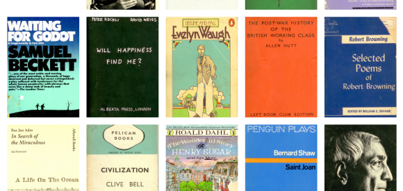
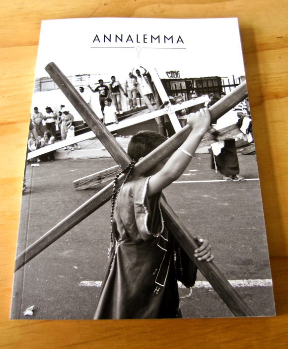
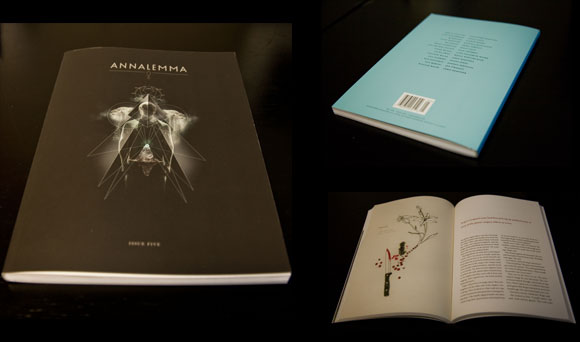
If you’re like me, a surge of happiness washes over you like a floodlight every time you come across a beautiful book cover. If you’re like me, you’re going to love 300KS, a collection of stunning book covers writer Dev Aujla has collected from his travels to used bookstores all over the world. Prepare to get lost in the wonder.
Archive for the ‘drawing’ Category
Justin Gibbens.
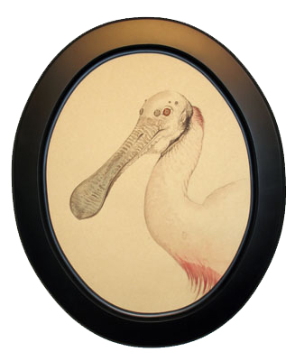
If you’re in the Seattle area this weekend, head on over to the G. Gibson Gallery where Issue #4 contributor and cover boy Justin Gibbens is showing new work from his series Spiderland. Justin focuses his fantastical lens in on a horrifically beautiful new series of Dr. Moreau-esque creatures that seem to be the hybrid of bird, mammal and arachnid. Thanks for the nightmares, Justin. For real though, Gibbens is an amazing talent and you’re going to want to check out his artistry in person.
An Interview with Walter Green.
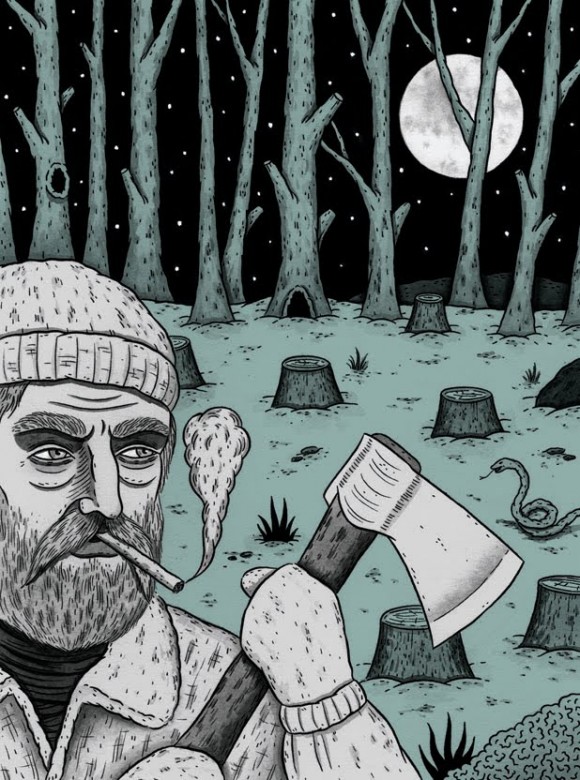
{Image by Walter Green, excerpted from the story “Golem” appearing in Annalemma Issue Eight: Creation}
Out of the blue, I got an email from Walter Green earlier this year requesting to work with Annalemma. I clicked over to his site to check out his work and immediately recognized some of the images. His work has made an impact as of late in our world of literary small press publishing, most notably at The Rumpus, McSweeneys (where he works as a designer) and the new food quarterly, Lucky Peach. I dig the overall vibe of enthusiasm, delight and unpretentious excitement permeating Walter’s work.
I had a chance to speak with Walter over Gchat about his work, where he gleans inspiration from and the perils of working in an office with x-acto knives and water coolers.
Annalemma: So how’s your day going? Can you talk about what you’re working on?
Walter Green: Sure, my day’s going well! I’m a designer at Mcsweeney’s publishing in San Francisco, and there are a lot of little branches that go along with that and a lot of different hats to wear, etc. So today, I’m working on designs for a few of our magazine/quarterly type projects, mainly this thing called Lucky Peach, which is our new food quarterly with David Chang. Besides that, I do interior design of books, book covers sometimes, book ads, press releases, and lots of little things. But today, mostly editorial design for this food magazine. Also, I am the DJ.
A: That’s amazing. So how’d you land this job?
WG: Well, I interned there a while ago, and never really did a lot of design stuff. I had the desire to do design but no experience really. So I did some things for free for my friend’s bands or their business ideas and what have you, and kind of amassed a little portfolio. Then I moved to New York for a while and helped out at a small but fertile design studio and made my portfolio a little stronger. And when I eventually moved back to San Francisco, I started doing some freelance design and that seemed to work out okay for us all. So after a while they asked me to be a junior designer and I quickly said yes!
A: That’s rad, I have to say I’m really jealous.
WG: Well, it’s fun but often really tough and exhausting.
A: About five years ago I was obsessed with McSweeneys.
WG: Then what happened!
A: I started getting more and more involved with the publishing world, started digging deeper, seeing what was out there, seeing all the presses that were doing cool stuff. I still love what y’all do, but my focus is spread out so far now.
WG: Sure, of course!
A: I thought McSweeneys was the only game in town worth a shit, for a long time.
WG: How long has Annalemma been going on for?
A: We’ve been putting stuff out for four years. But I always looked to McSweeneys for design inspiration, so when I heard you were a designer there I was immediately curious about what that’s like.
WG: Well, it’s fun and exhausting as I said. It’s a two-person design team, essentially. There’s me (I think I’ve dropped the junior from my title now) and an amazing art director named Brian Mcmullen. So we do the bulk of the work, with other people helping out when they need to. Everyone here has some idea of how to work indesign/photoshop/what-have-you.
A: I’ve always been blown away by the ambition and scope of the design work. Where does the driving force come from to make things look so good?
WG: Well, I can’t say for sure for everybody else here. We’ve never sat down and had a real conversation about why we make things look the way we look. Why not put some effort in to make something look good if you can? I guess you could also say that we like to make our things look the way they do in hopes that people will buy them, read them, keep them, etc.
Also, just on a personal level, I think we’re all very interested in trying out new things and new ways to present content, just to keep things fun for us. By the way, the design of your magazine is incredible. The clarity of design is really inspiring. KUDOS, is all!
A: Thanks man, I wish I could take credit for that, it’s all my designer Jen O’Malley, she’s really talented. She comes up with a lot of the ideas, I’m more of the philosophy guy in the background trying to make sure that nothing looks like it’s a part of disposable culture, trying to make it something that people will want to keep around for a long time.
But enough about me, how long have you been drawing?
WG: Since I was a small child, I guess. Though there are always long periods of inactivity–even today–when I don’t draw for the longest time and end up sort of completely forgetting how it’s supposed to be done.
Yeah, it’s tough to talk about drawing. I’m not very good at it, but it’s somehow become a part of what I do, just because I’m so interested in it. I wish I could be the kind of person where my brain and my hand are totally connected and I can draw whatever I can imagine. But it’s probably just not in the cards for me, so in my illustrations that I work on today, I don’t rely on the regular stuff that actual talented artists use. I’m kind of just grabbing whatever is around and throwing it all together and hoping that something sticks I’d say I’m more of a DESIGNER-ILLUSTRATOR than a straight-up-drawing-dude.
A: I like how you incorporate your drawings into your design work though. I’m cruising around on your site here and all your work at first glance just looks like it’s a lot of fun. Like fun to read, fun to work on.
WG: Yeah, I guess being even slightly talented at illustration is a huge boon to the kind of design work that I want to do, so I’m able to fill in holes where necessary in my design and it’s good to not have to rely on an illustrator.
A: What are some design resources that pump you up? What are the daily places you go to that are doing good work?
WG: Hey, hold on a second!!! “BRB”
A: k
WG: SORRY! people are looking for x-acto knives.
A: No problem.
WG: I like to visit that site 50watts.com for a lot of incredible vintage/classic/bizarre/whatever design work. I like to visit the sites of other designers I like. but mostly I like going into Dog Eared Books near my office here and obnoxiously browsing their covers! And a lot of inspiration comes from the people I worked with/have worked with/the work they’ve done.
A: Who are the designers you’re a fan of?
WG: I’ll forget people but some of my favorites are: Paul Sahre, Leanne Shapton, Rodrigo Corral, Paul Buckley, John Gall, and the aforementioned Brian McMullen.
There are a lot more who have sites that I’ll check out, but it probably means something that those are the first names I think of when asked about designers I like.
A: Yeah, first impulses are usually the best. Like I was saying before, I’m really digging the work on your site cause it all looks fun, how do you maintain that attitude? My designer and I can work on something for days and weeks and sometimes it can be hard to keep fresh eyes about it. I guess I’m asking what drives you, what do you want the audience to feel most of the time?
{pause}
WG: Hey sorry I was absent, I was changing the water cooler
A: Sounds busy there today : )
WG: I guess as a designer/illustrator I am going on a project-by-project basis. Some things that are, you know, more light-hearted and fun can be appropriate for some silly colorful hand-lettering, while other projects call for a more serious illustration/type treatment/design treatment/what- have-you.
Mostly, I’m hoping that the design can reflect the content in some way. That’s when it comes to editorial design/cover design/illustration and stuff. As for, how to maintain a happy and fun feeling while designing, I’m not sure that it’s possible all the time.
There’s definitely a large part of what you were saying earlier in what I do, where I’ll start a project and think it’s the greatest thing in the world. You know, ten weeks later, it’s hell. And I hate the whole thing, and I still have to carry on the fun feeling.
A: Haha, yeah when the excitement wears off.
WG: Yeah, definitely. But, I guess I’m lucky in that the littlest things are able to bring me design-excitement, something as simple as just changing one color to a design I’m “tired” of can make me love the project all over again, sometimes. And it’s also good that at my job, I have a wide range of things I can work on, so I can put projects down, and pick them up later and my hatred for them has died down.
A: Haha
WG: And I start to remember them fondly. And even miss them a little bit.
A: I hear that, I keep trying to do that, look at things from a different perspective in order to see it in a new way. I do that a lot with writing, like a story might not be working at all and it’s complete shit in my mind but something will click, like I need to change the perspective from third to first and everything will come together. I love it when those breakthroughs happen.
WG: Yeah, of course, little things like that that bring a clarity to the whole thing and can sort of show you the light at the end of the tunnel are the greatest.
A: So what’s the next release we should look out for? What’s good on the McSweeneys roster?
WG: Welp, I’ve been doing a little more editorial illustration work for a few different clients and that’s been fun. I do a weekly illustrated column for the bay citizen (a nice journalistic website focusing on the bay area) where I review different events that happen. So tomorrow I’ll be going to some sort of yard sale and then drawing the people I see there.
Beyond that, I’m mostly focusing on this food quarterly thing here that is shaping up to be great. This is the second issue, so we’re gonna be able to tighten up everything a bit from the slightly loose style we established in the first issue. And that’s fun because I’m able to do hand-lettering, or type design, or chalk drawings, or vector illustrations–just whatever the articles call for.
A: That’s cool.
WG: Yeah, beyond that, I’m not sure if I’m allowed to give the secret scoop on whatever stuff Mcsweeney’s is doing. But I can say that whatever it is, we’ll be trying to make it look nice!
A: Awesome, well, I can’t wait to see it whatever it is. Thanks for talking to me, Walter.
WG: Hey thanks for thanks for letting me do some work for your recent issue! I loved that story.
A: I’ll get that mag out to you soon, I spilled a big cup of water on a stack of personalized thank-you letters to contributors I was sending out with mags and I’ve been putting off rewriting them so I think that’s why you haven’t got yours yet.
WG: Gotta hate those big cups of water! No worriez!
A: Cool man, well thanks again and I’ll be in touch.
WG: NICE! Talk to you later bud! We’re CHAT-PALS NOW!
A: Haha, indeed we are, talk to you soon.
Click here to check out Walter’s work appearing in Annalemma Issue Eight: Creation.
Jon MacNair.
Check out illustrator and Issue Eight: Creation contributor, Jon MacNair. Jon provided some beautiful illustrations for the story “City” by Paul Kavanagh, wherein a couple moves away from the city to the country and brings all their city folk problems with them and, boy, does badness ensue.
MacNair’s got a fanciful style, imbuing his work with tons of heart and soul. And it looks like he’s having a great time doing it too. Also, check out his blog where he’s recently posted some images of Issue Eight along with big versions of his work appearing in the issue. Thanks Jon!
Issue Eight: Creation is Available for Pre-Order.
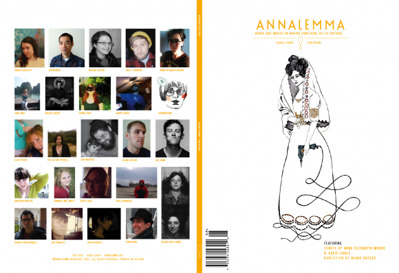
Barry Grass takes us to Belgium on a journey into the heart of artesian brewer Dany Prignon of the Fantôme brewery. Designer/dressmaker Jen O’Malley walks us through the American history of the bridal gown. Fiction writer Blake Butler talks about the role playing game he invented as a kid. Author/activist Anne Elizabeth Moore shows us the landscape of gender inequality in the world of comic books.
This issue is dedicated to creators, people who make things, people who use ingenuity to work around barriers. To the people who aren’t satisfied with a problem and instead of ignoring it, they face it and try to make it better. This issue is dedicated to the makers of the world.
This item is available for pre-order only. This item will ship July 15th, 2011. Order now and save $5 off the cover price.
Issue Eight Roster Announced.
[image: Donya Todd]
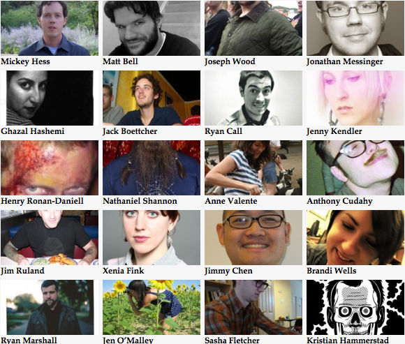
Behold, a tentative list of folks we’re publishing in Issue Eight: Creation. Thanks to all these talented folks who felt the desire to submit and those who responded to the call. I’m very excited about the stories and essays we’re publishing in the issue, I’ll be giving some details on each piece in the coming weeks. Also, big thanks to this issue’s readers who helped out big time in whittling these choices down: Sarah Bridgins, Sarah Rose Etter, Justyn Harkin, John Kemmick, Nicolette Kittinger, Eric McKinley, Anna Neiger, and, of course, Dylan Suher.
Also, thanks to everyone who’s helping out with our subscription drive (that’s helping us pay for this issue).
Nonfiction
I Tried Really Hard to Play
Essay: Blake Butler
Images: TBA
How to Make a Bride
Essay and Images: Jen O’Malley
Uncommon Knowledge
Essay: Gina Ishibashi
Images: Amber Albrecht
Phantasmogoria
Essay: Barry Grass
Images: Paul X Johnson
The Measure of Creation
Essay: Amanda Jane Smith
Images: Susan Hope Lanier
Fiction
Win a Chance to Be in my Next Novel
Story: Eliza Tudor
Images: Alvaro Tapia Hidalgo
South Beach
Story: Ryan Rivas
Image: Shannon May
Project
Story: Peg Alford Pursell
Image: Yann Faucher
Autonomous in my Rib Cage
Story: Maggie Ritchie
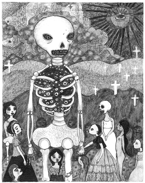
Images: Donya Todd
City
Story: Paul Kavanagh
Images: Jon Mcnair
Golem
Story: Dov Naiditch
Image: Walter Green
And it was Good
Story: Sam Libby
Images: Joe Gunn
Seeds.
I was in Orlando for a thing that ended up not happening so I went to see my friend Jason Gregory who runs a wildly successful leather goods company called MAKR.
He’s been doing well, so he had to bust down the wall of the space next to him and expand into this tasty realm.
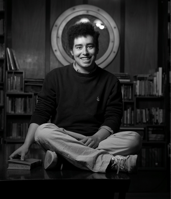
Jason was actually the inspiration for the creation issue. He sent me a text that said, “You should do an issue of Annalemma that’s all about making things.” I texted him back, “That’s a great idea.” And here we are.
I’m jealous of Jason’s wild success with his brand and his beautiful space with his antique mid-century furniture.
But whenever I get jealous I remember a scene from Seven Years in Tibet where Lhakpa Tsamchoe’s character says to Brad Pitt’s character, “A friend’s good fortune is a blessing. I’m sorry you resent ours.”
The workshop.
The bookshelf. Well, well, well. What do we have on the bottom shelf…
Jason will need something, like a coat hook, and make a design, get it a limited run manufactured and then sell them all. Once they’re sold, they’re gone, never to be made again.
Enough gushing, you get the idea. The dude makes rad stuff. We had an editorial meeting and it went well, gave us a lot of focus and I’m very excited about the direction of all this. It’s making me feel real good inside.
The man and his big ass desk.
Unrealted: new Brice at Stardust. Thanks, Orlando, for being rad.
Contributed.
After almost a year (a fucking year? really?) I finally got around to posting bios from the print issue contributors. Apologies if you were in the print issue and were at a party and told someone you were in the print issue of this bad ass journal and the person you were talking to went home and got on the internet to google-proofed your story and thought that you were a goddamned liar and then started telling people you were a goddamned liar and next thing you know everyone hates you and you’re living in a box. Sorry about that.
Also, contributor Paul Kwiatkowski got a shout out at the Paris Review blog for his essay Lions that first appeared in Issue Seven.
Also, we need artists. If you are an artist or know an artist and would like to illustrate a story we’re running on the web then email me at chris {at} annalemma {dot} net and I will probably like what you do.
Reading in 2011 pt. 2
Donald by Eric Martin and Stephen Elliott
What if Donald Rumsfeld got caught up in the state-sanctioned torture machine he helped design? That’s the premise of Eric Martin and Stephen Elliott’s short novel Donald. The main character is abducted in the middle of the night by a clandestine military group who take him to an undisclosed location where they begin a series of esotheric interrogations. It’s unclear what they want, and before the main character can even discern if he can give it to him, he’s taken to a Guantanimo-like facility where he becomes a prisoner of war he helped create. Events soon blur together, interrogation sessions become more clouded in mystery and alliances with guards and prisoners are formed quickly and dissolved just as fast.
Martin and Elliott have done an impressive thing considering the audience they’re catering to, considering the goal they’re trying to achieve. They’ve made the character of Donald into a person you sympathize with, a person you feel for and relate to and root for even though you don’t agree with his actions, his rationale, or his worldview. It would have been easy to take Donald at face value, to play up the caricature, to feed into the liberal desire to burn him at the stake. Of course, the premise of the book is hurling Donald into the downward spiral of confusing madness that is the military torture machine. The book borders on tedious as the interrogations become maddeningly repetitive and unproductive, but that comes with the territory when you’re trying to mimic the feeling of psychological torture.
People often question the importance of fiction. What’s its role? Is it relevant? What’s the point? Novels like this, ones that make clear, unflinching, political statements (ones that have the balls to come out on the same day as Rumsfeld’s true memoir) seem to be the answer to that question.
Another Bullshit Night in Suck City by Nick Flynn
This was the one that was everywhere when it came out. The one that was on all the book club lists, the one everyone was reading, even if they didn’t read all that much, even the people who only read three or four books a year, this was the one. I missed it. I missed it cause I was snobbish when this book came out. I was arrogant enough to think that I knew something that everyone else didn’t because I wasn’t going to get sucked into the hype train. What a dumbfuck mode to be in. What a willfully ignorant, up-my-own-ass-for-no-good-reason mode to be in. What mistake to miss out on a book like this because I’m stuck in this mode of thinking that I’m somehow better than someone else. What a waste of time it is to think like this. Think about how much this book could have taught you with its tight and powerful vignettes adding up to a monumental story. Think about all the time you wasted thinking you were hot shit when you were so much the opposite.
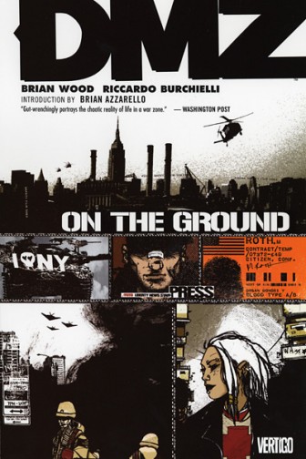
DMZ Vol.1: On the Ground by Brian Wood and Riccardo Burchielli
In the not-too-distant future, anti-social militias that pepper the country (once thought of as bastions of crazy inbred woods folk) awake like a sleeping giant and topple the US government. The borough of Manhattan becomes a Demilitarized Zone, where chaos reigns and no one has any concept of what life is like, where rumors end and fact begins. Inexperienced photojournalism intern Matty Ross is thrown headlong into answering these questions as his team is attacked when they land in the warzone and he’s left alone without a contact inside to pick up the pieces.
The macho, bar-stool voice bravado that seems to pervade most male comic book characters personalities isn’t skimped on in this series. The most interesting thing about DMZ is the story that lies beneath the surface, the story the news is often unable to provide about warzones: the story of what life is like for the individual. If post-apocalyptic genre stories should be judged not on the questions of why the word as we know it has come to an end, but what life is like for people after the fact and how communities attempt to rebuild themselves, then DMZ is worth a read in this regard.
Stampede.
Curator Meighan O’Toole presents a whole slew of low brow and contemporary artist on My Love For You is a Stampede of Horses. I was tempted to poach a lot of the artists she’s already showcases and do posts on them here but it made enough sense just to link you into her capable hands. Some of my favorites like Caitlin Hackett and AJ Fosik are extensively covered in interviews and images of artists in their process. If you are feeling culturally starved, consider MLFYIASOH an all day buffet.


