Archive for the ‘design’ Category

Monday, December 7th

B.B.C.D.W.: Democracy Edition.

Picture 5

Wow, been a while since we done one of these.

I’m calling bullshit on Amazon’s Best Book Covers of 2009. Given, there are some nice covers you can vote on, but does it irk anyone else that the nominees are all Amazon best sellers? What about all the choice book covers that have been featured on The Book Cover Archive? For my money, any given entry on BCA blows the Chronic City cover out the water. Let’s start our own list. Anyone have a vote for best book cover of the year? Post a link to the image in the comments section.

(Yes, I realize calling bullshit on Amazon is like calling bullshit on Disney or Starbucks, it’s granted at this point that they’re a huge greedy corporation that is the #1 enemy of the indie book store. Yes, I realize that their contest is a thinly veiled sales push for the holiday season. Regardless. Bullshit!)

Tuesday, October 13th

Tan.

IMG_3711copy

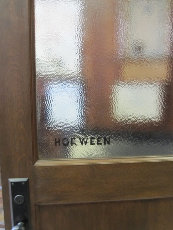
MAKR and I went up to Chicago. He had to go to Horween, one of the oldest leather tanneries in the country, to pick out some hides to make into bags.
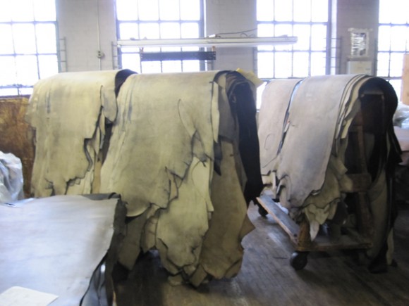
IMG_3668copy

It was like Charlie and the Chocolate factory. But with dead flesh.
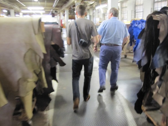
IMG_3669copy

This is what it looks like in Jason’s brain.
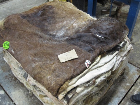
IMG_3671copy

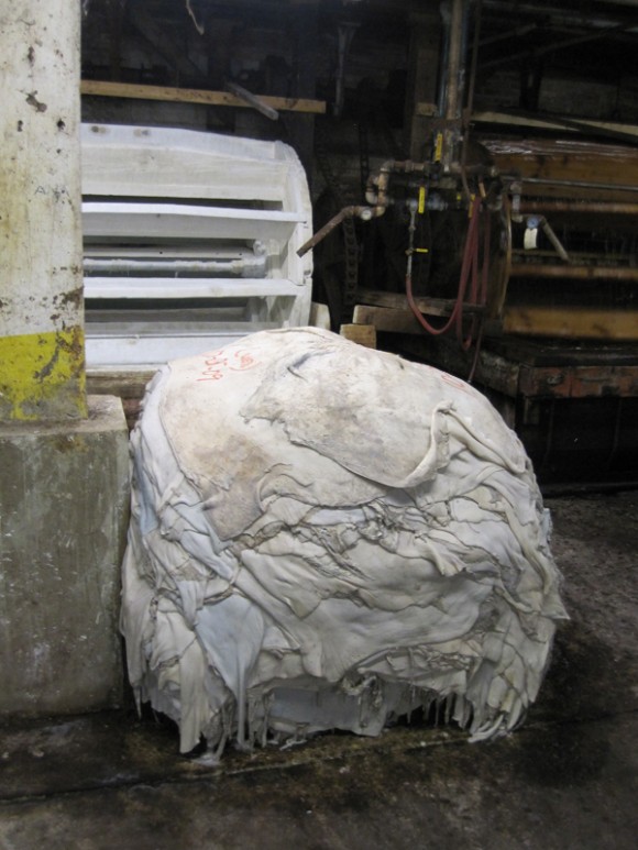
This is how the hides come in. That’s horse hide imported from France.

I want Horace McCoy to write a book called The French Eat Horses, Don’t They?
IMG_3675copy

The hides are bathed in a sort of bleach wash deal that turns them into pasty white piles of mush.
IMG_3678copy

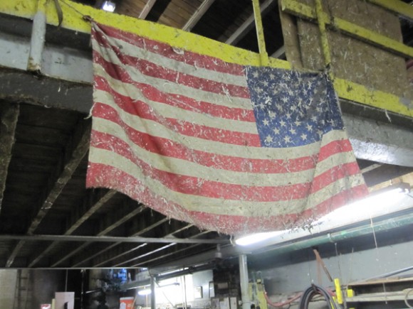
Leather byproduct splatter strewn across an American flag. There’s a metaphor there but I’m not sure what it is.
IMG_3690copy

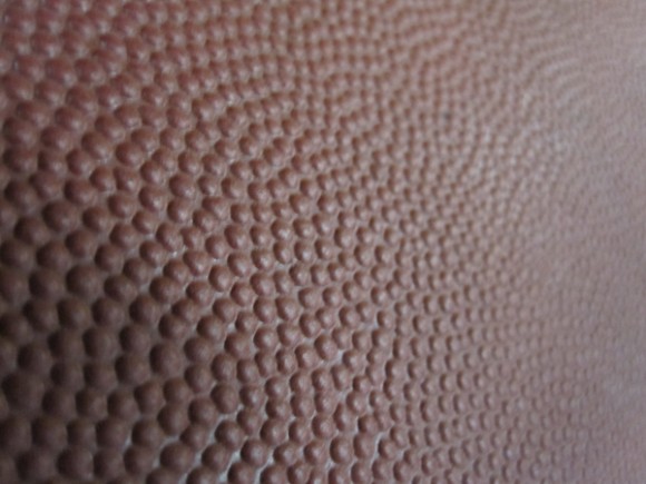
Most footballs used for pro games? Yup. They came from Horween.
IMG_3696copy

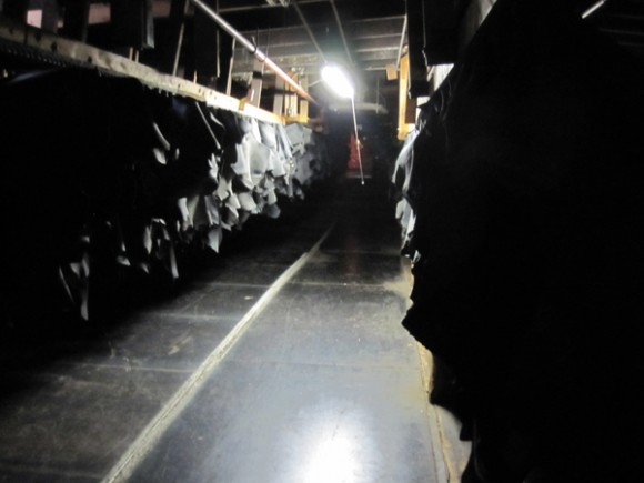
This place has been around since 1905 and is still family owned and operated. Skip Horween, the gentleman who showed us around, took us to this dark hole where the hides dry.
IMG_3704copy

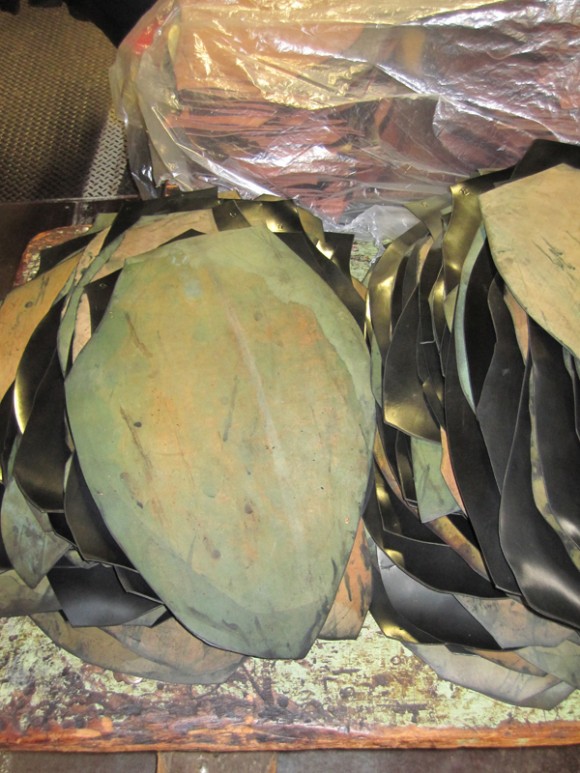
Horween is the last place in the States to make Cordovan, which is essentially the butt of the horse. I told Skip that it kind of looks like Illinois. He agreed and told us that an uncut hide looks like the United States. I said there was another good metaphor in there somwhwere. Skip quietly tolerated the foppish writer by saying, “Yeah, there’s something in there.”

IMG_3719copy

But it wasn’t all leather for us. Side note: I enjoyed introducing Jason to my Chicago friends by saying, “This is Jason. He’s really into leather.”

We went to the Russian Tea Room, which made people whisper further.

IMG_3735copy

We took the pink line (God, this is getting bad) down to Pilsen.

IMG_3738copy

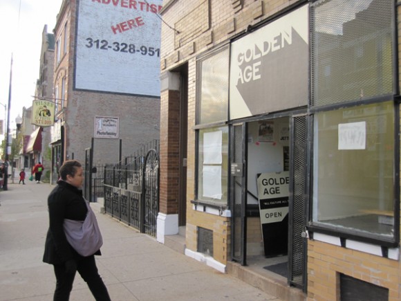
If you live in the greater Chicago area, care about the most interesting stuff happening in art book publishing and you have not yet been to Golden Age then you, my friend, are robbing yourself of one of the better experiences of your lifetime.
IMG_3741copy

Go see Marco and his amazing store right away!

IMG_3746copy

IMG_3748copy

IMG_3760copy

This was one of the best trips I’ve made back to the city since I moved. Without a doubt.

IMG_3767copy

Thank you Tom, Bill, Ben, Anne, Theresa and Sheba. I miss you all.

IMG_3771copy

And dare I say it? I miss this city.

Thursday, October 8th

Better Book Cover Design of the Week.

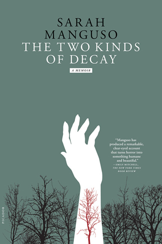
ttkod_pb_half

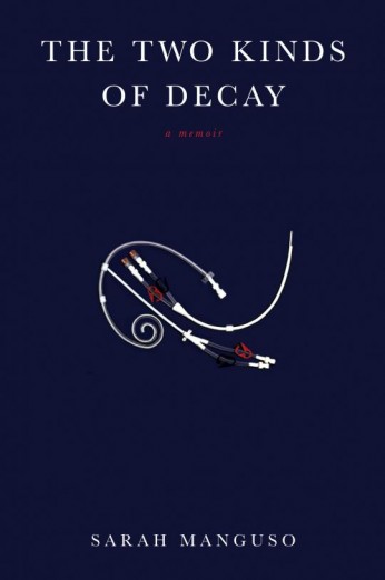
Sarah Manguso’s memoir concerning a blood disease that made her body turn against itself yields not one but two beautiful book covers. Above is the paperback (which I kind of like better, a bit more striking) and below is the more sedate, but equally beautiful, hardcover:

twokindsofdecay

Not sure what those things are. Some sort of medical supplies (IV tubes? Catheters?) shaped to look like a kind of musical signature symbol or type embellishment. I’m guessing a nod to Manguso’s poetic roots and lyrical language. Designs by Alexander Knowlton and Jennifer Carrow, respectively.

Thanks The Rumpus and BDR.

Thursday, October 1st

BBCDW: Better Idea Edition.

Picture 5

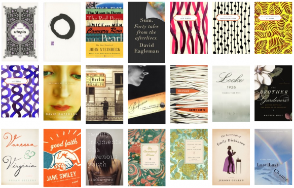
Designers Ben Pieratt and Eric Jacobsen have taken it upon themselves to archive some of the best book covers of recent memory over at The Book Cover Archive. While most bloggers are satisfied writing pithy reviews of book covers (ahem) BCA simply lets the cover speak for itself, as well as providing useful information as to who actually designed what. Well done fellas. Now go waste your morning at this place.

Monday, September 28th

Assembly.

IMG_3507

Read the rest of this entry »

Thursday, September 24th

Worser Book Cover Design of the Week: Glenn Beck Edition

Okay, so it’s pretty much a given that Satan is keeping a Choke Pear nice and glowing-hot for when Glenn Beck gets to Hell, but not for the reasons you’re thinking. Sure, whipping Fox News audiences into a fever storm of right wing fury that further polarizes our already fragile union (and making a shit ton of cash doing it) and refusing to take responsibility for his actions when it comes back to bite him in the ass, claiming it’s all entertainment and all in good fun, may seem like a damnable offense of the first degree. But what’s really earning him a red-hot goosing is his shitty book cover design.

41819035

What the fuck? You couldn’t get a real apple pie? Don’t you have art directors and production designers that cater to your every shitty whim? Couldn’t they at least make an apple pie out of resin and fiberglass or something? You of all people should know about things that may look nice on the outside but are actually filled with toxic chemicals. Instead of spending a few hundred dollars on production design you decided to stand there with your hands empty, mugging at the camera like an idiot. Then again, this is something you’re used to.

Thursday, September 10th

Better Book Cover Design of the Week: Ink and Paint Edition.

After roughly three or four years sitting in front of a computer one can get a little sick of pouring over images created on a computer. Let’s take a refreshing look at a lo-tech, high-skill way of producing a palatable cover…

38228533

Looking more like sale sign in a store front window than a book cover, Lauren Weber’s treatise on keeping things frugal uses its mistakes to its advantage. Why spend the money on a fresh piece of paper when you could do the grade school trick of erasing your mistakes and drawing over them bigger and brighter?

39064354

Bad Seed follows up And The Ass Saw The Angel two decades later with a story of a traveling salesman with a taste for seducing the women to whom he sells his beauty products. Things get upended in Bunny’s world when his wife commits suicide, thus sending him on a journey with his son, Bunny Jr., to try and escape the guilt he feels and the devil-horned madman who seems to be chasing them.

The UK cover bears mentioning due to its bad-assness and could fill a spot in this department on its own, but we’ve got a theme here and we’re sticking to it.

The US cover veers dangerously close to some sort of Sunset Strip, Ed Hardy, Chateau Marmont bullshit with the pinks and yellows and gothic lettering. It barely (just barely!) gets saved by the smudgy charcoal drawing and the presence of Nick Cave’s name, which could take even the corniest, sequined-est, fake-tanned-est thing and make it cool.

40731782

The most compelling title of the bunch is David Small’s Stitches. The memoir of a fucked up childhood, which may sound kind of standard fare for most memoirs, but sounds a hell of a lot more interesting when you find out it’s in graphic novel form by an award-winning children’s author.

Small’s washed out water colors seem like the perfect fit for a story about Kafka-dream/nightmare-reality wherein you wake up one day, you cannot speak and you are told you are expected to die soon.

Summation: Fuck computers. Let’s sling some ink.

Thursday, September 3rd

Better Book Cover Design of the Week: Futura Edition.

How to fuck up a good title font:

37432421

1. Put a cover blurb above the title that uses alliteration. This will be the first thing people see and will immidiately notify them that you do not give a shit how the cover of your book looks.

2. Put your title in with a time-tested reliable font. This will be the second thing that people see and it wil trick them into thinking that you might actually give a shit how your book cover looks.

3. Put in a long-ass subtitle that seems the requisite for most non-fiction books aimed at scarring parents into a fever-frenzy of buying, buying, buying things that might possibly make their manufactured problems disappeared.

4. WE’VE SOLD A SHIT LOAD OF BOOKS! SO IT’S GOT TO BE GOOD! RIGHT?! TEN MILLION PARENTS WHIPPED INTO PANIC-Y CONSUMER MODE CAN’T BE WRONG!

5. By this point it’s clear to the viewer that you do not give one microscopic fecal choliform cell about how your book cover looks, but they are trapped now and must finish viewing. So throw in a cluttered image that bluntly illustrates your point.

6. Fuck, you forgot to put in the author’s name. Just put it over the cluttered image. Wait, you can’t put it there, no one will be able to read it. I know, who gives a shit about the author, but she’ll raise a big stink about it. Just throw it in a gold box or something. That feels like an afterthought though. Probably because it is.

7. Looking a little too uniform? How about throwing all ideas about consistency and cohesiveness out the window by changing all the fonts and making them completely different from one another? Congratulations, you fucked up a perfectly good title font.

How to use a good title font correctly:

40171504

1. Get that cover blurb away from the top and make it work within the title itself. What’s that? It’s not the first thing you see? So fucking what. If you need Machiko Kakutani to tell you what books to buy you shouldn’t be trusted with money.

2. Two colors.

3. Hey, look at that, it’s the authors name in a clear and legible place at the bottom. And it’s in the same fucking font as the title. Imagine that.

Tuesday, August 18th

Friction.

frictioncover

In more-people-stealing-my-ideas news: the people at Sing Statistics took the idea of publishing stories and illustrations together and took it to dizzying new heights with We Are the Friction. An eyebrow-raisingly impressive list of contributors makes this collection look like a must have for the small-press collector/fiend in your life. The Brits done did it again.

Wednesday, August 12th

Worser Book Cover Design of the Week.

35911983

Got read a good submission yesterday from David Peak that got me thinking about horror. He wrote a bit about the video boxes of 80’s horror movies, which no one can deny the awesomeness of. It made me wonder if there were horror novels out there that reflected that era. Because as the above shows, there’s some vanilla bullshit out there right now.

I’m not going to go into how boring and unscary this cover is, or how that cover blurb is borderline embareassing (Most likeable book? Not exactly saying it’s a “triumph of the genre”, more like saying, “I had very little urge to barf.”), let’s just say horror novel covers these days are garbage and move on.

And now for some good old fashioned nostalgia…

stephen-king-it

Holy shit, did you not just piss yourself a little when you looked at this? Okay, maybe you didn’t cause you’re 26 years old, but imagine looking at this when you were 5 when you actually played on the sidewalk near storm drains and actually made paper boats. Nightmare city.
80s-trash2

Yes! Getting a little bit more schlocky now. It seems to me that there was a groundswell in the 80’s design world that just decided to throw subtlety and innuendo completely out the window. And I love them for it.

39076461

I guess this would be considered the Penguin Classics version of horror books. The Cthulhu mythos is really interesting but there’s so many better renderings of Lovecraft’s infamous god that this one seems a bit Marvel Comics in comparison.

Why do horror book covers suck so bad right now? I think people are too lazy or apathetic to be scared nowadays and the book covers reflect that. Gimme the old nightmare days. I want to see a new golden age of scary-as-shit horror book covers.

Anybody got any old favorites they want to share?