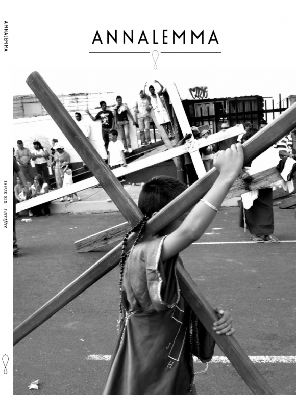
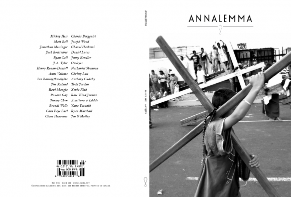
This is the cover for Issue Six: Sacrifice. The image comes from the photo essay El Pasion en Iztapalapa by Cara Faye Earl, appearing in this issue. I sent this to our intern and she said Oh Jesus, it looks like we’re a Christian mag… are we a Christian mag?
What do you think? Too religious? Would the appearance of a cross preclude you from picking up a magazine? Why?


This is so beautiful, Chris. I do have a fondness for B & W photography and the lines in this are crisp and intriguing. I don’t find it overly religious but I also don’t have issues with crosses. This would draw me in because I want to know why these people are strolling around with crosses on their backs. Cannot wait to see this issue.
I think it looks great, Chris. Not overly religious at all, since it’s not in that context. And even what religious tones there are good allusions. I mean, for a sacrifice issue, this is a pretty recognizable image, right?
So excited about this!
Hey Roxane and Matt! Glad yall like the cover. My intern suggested that most creative types have issues with religion and that might turn some people off. But I’m kind of interested in paying off those anxieties that religion can instill, especially in artists. It’s easy to dismiss religious folks as nuts, it’s harder to try and understand them.
I think it’s a striking image for both camps. As a bonus, the Christians who pick up the mag will be exposed to the subversive material in both of your stories and hopefully converted to the darkside.