Read the rest of this entry »
Archive for the ‘art’ Category
Issue Five Pre-Sale.
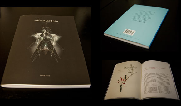
Head on over to our print store where you’ll find Issue Five available for pre-sale.
We’re also pleased to announce that this issue will feature a limited edition letterpress piece by Danny Jones as part of his series “Dawn of Man” appearing in this issue. Only 750 of these pieces will be pressed before the plates are destroyed. So reserve yours today!
Ghanaian.
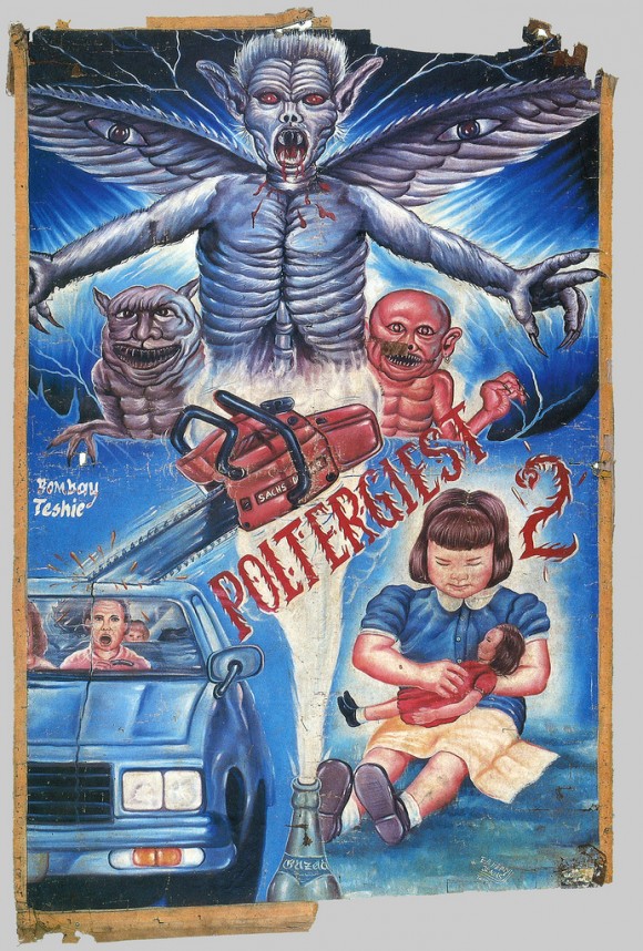
This collection of Ghanaian movie posters from popular films of the 80’s and 90’s over at Ephemera Assemblyman will blow your mind and make you wish the artist(s) could paint murals in your home. See also Polish movie posters.
Better Book Cover Design of the Week: Ink and Paint Edition.
After roughly three or four years sitting in front of a computer one can get a little sick of pouring over images created on a computer. Let’s take a refreshing look at a lo-tech, high-skill way of producing a palatable cover…
Looking more like sale sign in a store front window than a book cover, Lauren Weber’s treatise on keeping things frugal uses its mistakes to its advantage. Why spend the money on a fresh piece of paper when you could do the grade school trick of erasing your mistakes and drawing over them bigger and brighter?
Bad Seed follows up And The Ass Saw The Angel two decades later with a story of a traveling salesman with a taste for seducing the women to whom he sells his beauty products. Things get upended in Bunny’s world when his wife commits suicide, thus sending him on a journey with his son, Bunny Jr., to try and escape the guilt he feels and the devil-horned madman who seems to be chasing them.
The UK cover bears mentioning due to its bad-assness and could fill a spot in this department on its own, but we’ve got a theme here and we’re sticking to it.
The US cover veers dangerously close to some sort of Sunset Strip, Ed Hardy, Chateau Marmont bullshit with the pinks and yellows and gothic lettering. It barely (just barely!) gets saved by the smudgy charcoal drawing and the presence of Nick Cave’s name, which could take even the corniest, sequined-est, fake-tanned-est thing and make it cool.
The most compelling title of the bunch is David Small’s Stitches. The memoir of a fucked up childhood, which may sound kind of standard fare for most memoirs, but sounds a hell of a lot more interesting when you find out it’s in graphic novel form by an award-winning children’s author.
Small’s washed out water colors seem like the perfect fit for a story about Kafka-dream/nightmare-reality wherein you wake up one day, you cannot speak and you are told you are expected to die soon.
Summation: Fuck computers. Let’s sling some ink.
Cover Songs.
So we were all set to print at the beginning of the week when I get a call from Jen saying that the trim size is too big. The printers contacted her saying that we were a quarter of an inch over what we were quoted and they couldn’t do it without switching machines and ordering new paper and ultimately costing thousands of dollars more. “That’s bullshit,” I said, and decided to call the printers. As I was dialing I remembered that we had, in fact, changed the print size two issues ago because of this same cost issue and I’m such a fucking idiotic simplton that I just plum forgot what size my own magazine was and gave Jen the wrong size from the get-go. Sound confusing? It is.
Nevertheless, Jen sighed, shook her head, silently cursed my unborn children and got to work re-formatting the entire magazine. And did it in one night. So we’re going to go out tonight and I’m going to buy her new buns because she worked hers clean off this week.
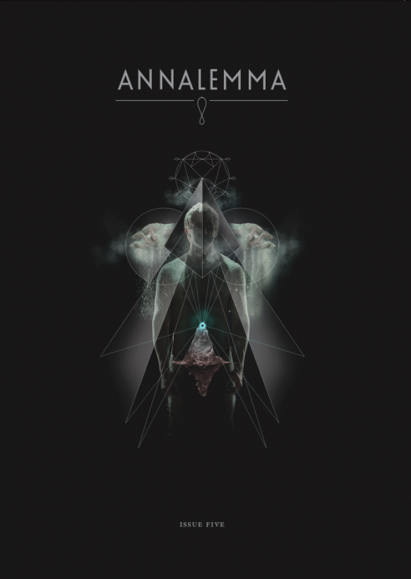
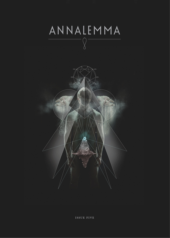
Oh, and this is the cover. It’s from Danny Jones’s series Dawn of Man which appears in the mag. And it’s the sexiest cover we’ve ever had the opportunity to print.
Thank you Jen and Danny and everyone else involved for being way more professional than me.
Better Book Cover Design of the Week: Futura Edition.
How to fuck up a good title font:
1. Put a cover blurb above the title that uses alliteration. This will be the first thing people see and will immidiately notify them that you do not give a shit how the cover of your book looks.
2. Put your title in with a time-tested reliable font. This will be the second thing that people see and it wil trick them into thinking that you might actually give a shit how your book cover looks.
3. Put in a long-ass subtitle that seems the requisite for most non-fiction books aimed at scarring parents into a fever-frenzy of buying, buying, buying things that might possibly make their manufactured problems disappeared.
4. WE’VE SOLD A SHIT LOAD OF BOOKS! SO IT’S GOT TO BE GOOD! RIGHT?! TEN MILLION PARENTS WHIPPED INTO PANIC-Y CONSUMER MODE CAN’T BE WRONG!
5. By this point it’s clear to the viewer that you do not give one microscopic fecal choliform cell about how your book cover looks, but they are trapped now and must finish viewing. So throw in a cluttered image that bluntly illustrates your point.
6. Fuck, you forgot to put in the author’s name. Just put it over the cluttered image. Wait, you can’t put it there, no one will be able to read it. I know, who gives a shit about the author, but she’ll raise a big stink about it. Just throw it in a gold box or something. That feels like an afterthought though. Probably because it is.
7. Looking a little too uniform? How about throwing all ideas about consistency and cohesiveness out the window by changing all the fonts and making them completely different from one another? Congratulations, you fucked up a perfectly good title font.
How to use a good title font correctly:
1. Get that cover blurb away from the top and make it work within the title itself. What’s that? It’s not the first thing you see? So fucking what. If you need Machiko Kakutani to tell you what books to buy you shouldn’t be trusted with money.
2. Two colors.
3. Hey, look at that, it’s the authors name in a clear and legible place at the bottom. And it’s in the same fucking font as the title. Imagine that.
Friction.
In more-people-stealing-my-ideas news: the people at Sing Statistics took the idea of publishing stories and illustrations together and took it to dizzying new heights with We Are the Friction. An eyebrow-raisingly impressive list of contributors makes this collection look like a must have for the small-press collector/fiend in your life. The Brits done did it again.
Worser Book Cover Design of the Week.
Got read a good submission yesterday from David Peak that got me thinking about horror. He wrote a bit about the video boxes of 80’s horror movies, which no one can deny the awesomeness of. It made me wonder if there were horror novels out there that reflected that era. Because as the above shows, there’s some vanilla bullshit out there right now.
I’m not going to go into how boring and unscary this cover is, or how that cover blurb is borderline embareassing (Most likeable book? Not exactly saying it’s a “triumph of the genre”, more like saying, “I had very little urge to barf.”), let’s just say horror novel covers these days are garbage and move on.
And now for some good old fashioned nostalgia…
Holy shit, did you not just piss yourself a little when you looked at this? Okay, maybe you didn’t cause you’re 26 years old, but imagine looking at this when you were 5 when you actually played on the sidewalk near storm drains and actually made paper boats. Nightmare city.
Yes! Getting a little bit more schlocky now. It seems to me that there was a groundswell in the 80’s design world that just decided to throw subtlety and innuendo completely out the window. And I love them for it.
I guess this would be considered the Penguin Classics version of horror books. The Cthulhu mythos is really interesting but there’s so many better renderings of Lovecraft’s infamous god that this one seems a bit Marvel Comics in comparison.
Why do horror book covers suck so bad right now? I think people are too lazy or apathetic to be scared nowadays and the book covers reflect that. Gimme the old nightmare days. I want to see a new golden age of scary-as-shit horror book covers.
Anybody got any old favorites they want to share?
Martine Johanna.
I’m sick today and the only thing that’s making me feel better is Martine Johanna‘s crazy ass ilustrations. Her work, at times, feels like a mix between Alfons Mucha and J-horror films. Frightening and beautiful all at once. Just what I need to clear my sinuses.
blogeyes.
Issue #3 contributor and all around fantastic artist owleyes has exploded onto the blogosphere in the last few months with andiamonds. Certainly interesting to get a looksee into all the freaky things that influence his work.
Enjoy your freaky Friday and equally freaky weekend!


