


Full disclosure: This weeks BBCDW entry comes more out of an interest in the material itself than an interest in the accompanying design, which, as will soon be explained, is not all that great.
I’ve been sitting at my desk all this week (plopped in front of my desk, really) contentedly chipping away at a new issue. Yesterday, though, something hit me all the sudden. Holy Shit. I’m a 27-year-old healthy young man. What the fuck am I doing whiling away my days at a fucking desk when I could be out breaking laws and jumping my motorcycle over gorges. Or at the very least, introducing myself to random women on the street and having long drawn out conversations about life and love, a la Before Sunrise. Taking some sort of risks, I guess, instead of being cautious and careful all the time.
That’s why William Gurstelle’s new book struck a chord with me. Living dangerously reminds you that you’re alive, not a worker drone toiling away for dubious reasons. Kind of an idealistic, college kid notion, but the truth nonetheless.
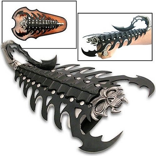
The cover design, on the other hand, is nothing special. It aspires to greatness, something along the whimiscal lines of The Dangerous Book for Boys, but falls shamefully short. The little flamethrower man is an almost embareassing example of poor Adobe Illustrator skills and the knives in the lower left almost look like cooking cutlery, not anything truly menacing, like so. It appears they were going for the turn-of-the-century Almanac aesthetic but just ended up with a design hodge podge straight out of Stuff magazine. Hopefully they can get it together for the paperback. What’s that? This is the paperback? Yikes.


the human stain, the travis dopp story