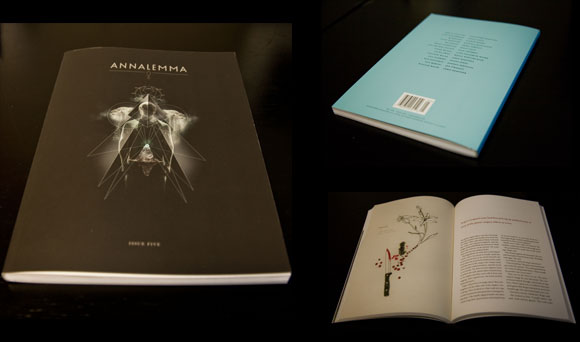
Even though this little gem was a steady competitor for this week’s BBCDW, I decided not to go with something that took me five minutes to mock-up in InDesign.
This collection came out almost a year ago but it’s just popping up on my radar. The cover for the Justin Taylor-edited collection concerning the end of days has a look like it’s survived a 50 year stint in an underground fallout shelter. No surprise why this is viscerally appealing. Writers and lit types love old shit. Preferably mid century old shit. It reminds them of a time when novels and stories held greater sway with the average American psyche. Days before the Facebooks, days before every new product name was preceded by a lower case “i”. Don’t worry writers. Those days will be over soon. In fact, all the days will be over soon. Excellent work on facilitating the end of the world, Justin Taylor.


For the interested, the typeface is Goudy Trajan.