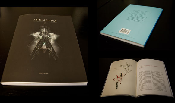
While combing the webs for a good book cover design for this weeks entry of BBCDW, I came to realize something: Most book cover designs fucking suck. Well, fiction at least. There’s more bad out there than good is all I’m saying. So, not really trying to spread any negative vibes around the earth, but it’s just easier to find bad book covers than it is to find good ones. If a real gem comes down the pike, I’ll shine a light on it.
So. Chabon. What the fuck. You used to be able to count on this guy for some cool looking shit. WTF happened? That subtitle font looks like those little plastic refrigerator magnet letters you had as a kid. Only a designer who’s truly given up could not see that. Anyone know the name of that font? Bob? I propose we address the Lords of Typography and have it stricken from the National Font Conservatory.
On an unrelated note, DON’T FORGET.


