Chicago’s Gabriel Levinson (of Book Bike fame) is trying to earn his place in my books as raddest dude ever.

He’s coming pretty close to it too.

Thank you Gabe. You are a gem of a human.


Chicago’s Gabriel Levinson (of Book Bike fame) is trying to earn his place in my books as raddest dude ever.
He’s coming pretty close to it too.
Thank you Gabe. You are a gem of a human.
Say friend, do you like things? Were you aware that people still do things these days? It’s true. Here are some things that have happened (are happening):

Issue #4 and Issue Six: Sacrifice contributor Todd Jordan‘s Now I Remember collective is showing the world through their cell phones at New Image Gallery (best click through image) in LA this weekend. I know you live there, I have Google Analytics. Go to this show.

Issue Five contributor Amelia Gray released her second collection of fiction, Museum of the Weird on FC2 yesterday. Amelia is a writer in a class of her own that never disappoints. Buy this book.

Dear friend, Alix Soubiran, is showing her lovely animals at Bold Hype‘s new gallery in New York this weekend. Go see them. You will fall in love with them and her.

Issue Five contributor Max Kauffman is throwing his first solo show in a long time in Chicago. Go and check out his freakiness next month. From the press release:
R’fuah- new works by Max Kauffman
presented by Pawn Works
1050 N Damen Ave Chicago, IL
opening reception Friday Sept 10th 6-10 pm
available by appointment 312-841-3986

R’fuah: a renewal of spirit. A way of looking at things you hold dear, without idolizing them: knowing that these inanimate things you keep are important because of the emotions you impart on them. Are they real? Are the emotional ties meaningful because of the item or because of the emotion itself?
These thing we hold dear: they keep us happy, bittersweet, positive, appreciative of the things in our life. Why? Are they simply coping mechanisms or do they actually uplift us? From prophets and idols and relics to symbols and talismans of today, we alternately assign them power and draw power from them. We are actually pulling on the strength within ourselves, our thoughts and spirits when we look to these things. When we fall on dark times, we become even more attached to the inanimate—sure and committed to the power we believe they bring, until the storm passes and we relinquish them until next time.
This renewal, this evolution, this cycle of spirit and material. Does it make us more or less human? By putting our faith in objects, are we overpowering or overpowered by them?
They calm us; they bring us peace. R’fuah.
R’fuah will feature new mixed media paintings on paper and wood, ceramic works and a site specific installation.
Show runs through October 10th
for more information contact marz09@yahoo.com or mhkauffm@gmail.com

It’s impossible to talk about this book without talking about how it was made so we’ll get that out of the way first. Kaelan has embraced the idea of the book-as-object, adding another layer of immersion for the reader.
Interior pages of the book are 100% recycled paper, but the cover is the impressive feat of printing: All first editions have been letter pressed on seed paper, a kind of recycled paper containing birch tree seeds that, once planted, have the capability to offset the carbon footprint of the book 10x over. It’s part of the Zero Emission Book Project, Kaelan’s effort to release and support a book without the use of unsustainable energy.
Most products of the green movement are not made to benefit the environment, but to make the consumer feel better about themselves. To alleviate a degree or two of the inherent guilt the consumer feels for being a consumer and not a sustainer. The reading experience is permeated by the objectness of the book: Running your fingers over the spruce seeds embedded in the pulpy cover, the debossed orange silhouette of a naked man swinging a coyote around his head by the tail, serve as a constant reminder of the production means used in the printing of the book.
Strange (and somewhat depressing) that it takes a book of fiction to embrace the idea of a sustainable printing. Meanwhile, mountains of nonfiction reference and instrucitonal books on becoming environmentally conscious employ conventional production means, completely dismissive of the ideals they tout.
This wildly inventive and ambitious project veers close to overshadowing the content of the book. But after reading, it’s clear that the story is only enhanced by the production means. We’re Getting On is the story of Dan, a man who can best be describe as an environmental regressionist. Dan recruits a gang of four strangers, almost on a whim, to follow him out to a tract of land where the plan is to fully remove themselves from the trappings of modern living. But it’s not long until the experiment in sustainable living fails and morphs into an exercise rejecting forward, or even lateral, movement and moves toward the direction of regression. Dan’s totalitarian control over the group is tenuous. Cracks and divides show themselves until the structural integrity of the collective falls apart completely.
This is a book about the effect of restrictions. The object restrains itself from using simpler, cheaper forms of publishing for the sake of producing a book that has little-to-no carbon footprint. The characters in the story restrain themselves from using any sort of innovation or mode of being that would make them human. Dan strives to become something less than human, something that doesn’t that doesn’t have aspirations to rise above its environment, a struggle to become just another insignificant organism.
The story and the object make a statement in two parts: sustainable living is possible, but it doesn’t have to be what you think it is. It could be seen as an attack on sustainable living, like, taken to its logical conclusion we should all be aimed toward Dan’s goal, tearing ourselves away from progression and devolving back to homo-erectus status. But the statement the object makes is that humans are capable of living sustainably, we’ve done it before, we can do it again. And it’s possible for us to do that without backtracking on the evolutionary ladder. Dan illustrates this in the last chapter as he’s been exiled from his collective and wanders, starving and fragmented, among the harsh elements, “(A) new beginning seems beyond my grasp. I’ve gone too far in the other direction, and this isn’t a circle or a cycle, but a spectrum at the ends of which are two terminal extremes.”
Taken by itself, the story stands alone and is worth the read. But taken with the object, the reading experience becomes something larger: a book that whole-heartedly embraces a polarizing issue in a way that is passionately creative in execution and radically practical in its ideal. It’s more than reading a work of fiction, it’s actively participating in a movement.
Buy it here from Flatmancrooked.


My blood pumped a little faster when I opened up my RSS feed this morning and saw two things that I loved were combined into one great thing: The Rumpus had interviewed Jesse Hlebo. To be honest, I’d let Jesse fall off my radar a little bit since he sent us some photos for a piece we ran in Issue #4. What a mistake. For the past year, Jesse has been putting a lot of his contemporaries to shame with his never-ending enthusiasm and work ethic. Check out Swill Children, a small press and record label started by Jesse and a few of his friends. Already they’ve released a fistfull of 7″ records, a zine featuring the photography of David Potes and a lit and arts broadside called _Quarterly. Oh, and he’s only 21.
For your dedication to positivity and community within the arts, for your inspirational work ethic, for your accomplishments in creating beautiful things, Annalemma salutes you, Jesse Hlebo.

Issue Five contributors Danny Jones and Jonpaul Douglass have started a new monthly online publication dedicated to gentlemen and the crafts that they love. Grain & Gram interviews men immersed in, and enthralled by, the process of making things. The second issue went live yesterday and features letterpress guru Nick Sambrato, of Mama’s Sauce Print Shoppe. My favorite thing about G&G is the scroll-ability of the page. Most websites are obsessively all about the clicks. Danny’s meticulous attention to detail and angular design style paired with Jonpaul’s rich, textured photos eliminate any desire to leave a page, making the G&G reading experience a smooth and engaging one. Cheers to Danny and Jonpaul for, yet again, making something very cool. Looking forward to seeing who they spotlight next.

Digital designer, Judy Rush, offers insight into the realm of 21st century photo editing with real/fake. Rush pioneered the surreal aesthetic that’s been dominating the ad campaigns of Fortune 500 companies lately. real/fake shows the process, from digital editing software to old fashioned smoke and mirrors. It’s always interesting to see things get made. Is it just me or does it remind you of the writing process? You start with an image or a sound that captures your attention for wahtever reason and you try to create a world to give it some context. Strange that photographers and digital media artists have to rely on software to get their vision across. Sometimes it’s inspiring that all a writer needs is her noggin.

Haven’t done one of these in a while. 120 in 2010 kinda bumped them out of ranking as of late, but since I’m sloughing through a short story collection right now I’m happy to return to reviewing book covers.
Apologies for not finding a bigger image for Paul Blooms’s How Pleasure Works, an exploration into the inner-workings of our desires. It’s really hard to use embellishments like the ones flanking the subtitle without it looking like you’re trying to cultivate a look of high falootin’-ness. The stark, empty space background is nothing new but the oyster with the pearl inside is provocative and the most interesting thing about this cover. There isn’t cover design in recent memory as overtly vaginal as this one, the designer pulling a double whammy of desirable imagery, albiet in a not-terribly-subtle fashion. If neither of these images is desirable to you then here’s the boring, cheesy SFW cover:


The idea behind 48 Hour Magazine is an interesting one: Using all the tools of media available today to create a magazine that’s cool, fast and cheap.
In the opening letter the editors state they’re trying to marry the immediacy of the web with the permanence and beauty of print. A few weeks ago they announced a call to submit, people gave them their email addresses and the editors of fired off the starter pistol in the form of announcing the theme. Then a 48 hour frenzy of writing, photographing, illustrating and designing an entire 59 page magazine. Using a print-on-demand service called Mag Cloud, they uploaded a PDF file, figured out how much to charge for the magazine (Mag Cloud charges 20 cents per page) then folks go online, order it and it gets printed and shipped to them in a couple of days. Take a moment to catch your breath.
The only thing I’m having a problem with is this “beauty of print” part of the equation. While the print design is clean and straightforward, the images colorful and immediate, the actual quality of the book itself is inscrutable from anything you’ll find on the newsstands. I guess when I think of the “beauty of print” I think of magazines like Cabinet or McSweeneys, publications that treat the magazine as an artifact, another arena and opportunity to make something beautiful, to make a statement, and hopefully differentiate itself as much as possible from anything you could ever find on the web. But maybe that’s just me holding unrealistic standards.
The content is fun and resonant, the charts and graphs are colorful and informative. But the words seem to only skim the surface, a roadblock they no doubt hit due to their time constraint. It’s hard to come up with in-depth writing in less than two days.
The most impressive and appealing thing about 48HR is the speed with which it was created, a speed that speaks to the youthful feel of the book. The energy and exceitment, even the theme of the issue (Hustle), radiate this kind of vibrancy and possibility that’s downright sexy.
Final verdict: awesome (revolutionary?) media experiment. Future of print? Debatable.

Shannon Gerard is an illustrator, designer and artist based out of Toronto, Ontario. Novelist and indie publishing guru, Jim Munroe, recently tapped Gerard to pen the images for the latest installment of his graphic novel series, Sword of My Mouth. In Munroe’s post-rapture universe, literal magic is possible when a “field” is lifted from the earth by a mysterious entity, now making anything in the human imagination possible, like casting spells, mutating oneself into a fish-person and the rapture of millions of believers up into the stratosphere. The first installment, Therefore Repent! took place in Chicago, with familiar locales and landmarks playing a large role in the story. SoMM continues this theme by adopting the people and places of Detroit to tell the story of what happens in a world where the impossible is possible and who’s playing the angles to exploit the situation.
I spoke with Gerard via email regarding her artistic process, collaboration and urban gardening. Enjoy.
A: How did the SoMM project get started?
SG: Jim asked me to give him some feedback about Therefore Repent! way back before it was published and I was pretty excited about the story because I’d grown up in Christian youth group watching the Left Behind movies and hearing pretty serious takes on the Rapture. When SoMM came around, it was a really great opportunity for me to explore some of that weirdness and also address the humor in those childhood experiences through being part of Jim’s fictional world.
A: How much of the completed story did Jim bring to the table?
SG: I think he just knew that he wanted the story to be set in Detroit and maybe had a loose idea about the characters. Early on we took a research trip to the city with a very sketchy framework in place. I wanted to take as many pictures of the city as possible and Jim (I think) wanted to meet people and find out what issues were most important to the place for people really living there.
A huge leap for the story was seeing some of the urban gardens that exist in Detroit, especially the Catherine Ferguson Academy which is this amazing, fully producing farm with a wide range of vegetables, so many kinds of animals, a solar barn, a little orchard and an apiary. It is smack in the centre of a seriously depressed urban area. I’m guessing it is like 3 or more acres big. Amazing. The volunteers working there on the day we visited were incredibly open to showing us around and gave us so much to think about self-sustainability.
One of the mottos I noticed on a lot of signage in Detroit was “Say nice things about Detroit!”– as if people living there really believe in the power of stories to transform popular (and sometimes really wrong) opinions about places. Almost without exception, the folks we met were so happy and so eager to talk about their city to us.
So those research trips (we took 2) helped the story in SoMM to evolve.

A: How much of the obligation was on you to tell the story visually?
SG: I would not call it obligation since the dynamic between Jim and I while working was really open and equal. I never felt it was Jim’s story that I was interpreting or trying to “get right.” Since he involved me so much right from the beginning by inviting me to drive to Detroit with him, I felt like I understood his way of creating and knew where the tensions and plots and motivations of the book came from. We talked a lot about the characters and their relationships since that is so much the focus in my own work and it was really great how much freedom I had to communicate those emotional sub-plots and back-stories through the images.
Also, Jim was really open to my panel-less structure. Even though he gave me a script with traditional panel breakdowns, he was really into just letting me work all of his described panels into a page without organizing them so linearly. In a few instances, he gave me really specific instructions for layouts and those ended up being some of my favorite pages. I think he will not like the word “instructions” though since there was never a feeling of him telling me what to do. I had so much freedom and he even rewrote some dialogue to accommodate my drawings! Who gets that chance as an illustrator?! In a word, (the collaborative process was) amazing. I am so lucky to have such a great first experience with collaboration.
A: Can you describe your work process? Do you work with models? Any computer programs involved?
SG: I work with models who actually act out the story in improvised segments as I take pictures. I give them a lot of background information about their characters and relationships but we don’t read the dialogue at all since I do not want the images to look scripted. Candid human moments between the models are what is most important to me in drawing, so this process allows me to capture as much of that quality as I can. There is also everything the models themselves bring (as improv actors) to the story that shows up in the drawings. By not reading the script but just playing the story out, I was able to draw upon so much that felt real and in that way told my own version of the story, along with and in support of Jim’s script. Lucky for me that he never felt threatened or weird about that but embraced it as part of the book.
After I have like 500 more photos than I actually need, I go through them and choose the ones that reveal or represent the best moments from people. So many times, I am compositing pictures from multiple shoots because the models are rarely all available at the same time. Then I make photo-based mock ups of the pages and print and trace those photos as drawings. (Using my beloved micron 0.2 pens. I went through literally hundreds of those pens on this book!) My favourite example of the compositing of separate shoots into one drawing was a page on which two characters hug. The models in that embrace could not meet on the same day, so in both shoots, they hugged a stand-in. Then later I drew them hugging each other. The stand-in was the same person in each shoot, so if you could see behind the curtain where he was edited out, you’d have a drawing of him hugging himself.
I don’t draw the pages as they look in the book but work on individual frames. Then I use photoshop to composite the drawings into the layouts that appear in the final story. It is a time consuming process to not draw the pages as whole compositions, but I like how much freedom it gives me to make choices about character relations and page design as I go along.

A: When did you do your first comic and was there a particular artist that inspired you to play with that form?
I guess I started working on comics in 2003 or so when I made this stupid inside-joke static type comic about the bookstore I worked at. That embarrassing PoS was called Five Finger Discount.
My inspiration to make comics did not really come from another visual artist but from essayist Annie Dillard. I was drawing a lot and also writing a lot and then read a piece in which she described the realization that she could be a writer without being a novelist. She said that deciding to write creative non-fiction and poetry felt like switching from a single reed instrument to a full orchestra. That made such exact sense to me and I started to play with mixing text and images and with making artist’s books.
A: How does working in a short form compare to a full-length graphic novel?
SoMM is my first long form project. It was a huge challenge to work for so long on telling one story, but I am lucky to have done it as a collab. I’m not sure I would have had the faith in my own work over such a long period.
A: Did you study any graphic novels before starting work on SoMM? Any influences?
SG: I didn’t study any works in particular but I looked to my heroes for a lot of inspiration: Rutu Modan, Jillian Tamaki, and Lynda Barry. I also read a lot of my favorite prose to keep up the moony, emotional floatiness I like while drawing: Miriam Toews, Michael Ondaatje and Kathleen Norris.

A: How long did the it take to complete the work?
SG: Over a year. I clocked around 1000 hours.
A: Do you have any plans for future graphic novels?
SG: Yes, I am working on a collection called Unspent Love; Or, Things I Wish I Told You. Not a long form story though. It is a collection of small prose-poemy vignettes.
There is also a slow burning story in the works about my father’s childhood.
And I am also trying to tie up, once and for all, my older series Hung by printing a fourth story over top of the first story. A printer’s error in 2005 ended up giving me an extra 200 or 300 copies of Hung #1, which I am now so embarrassed by (that’s good right?), so I am resolving some of that anxiety by using a letterpress to overprint Issue 4 on top of the older books.

Sword of My Mouth is available now and can be purchased here.
If you are an American, you must allow all ideas to circulate freely in your community, not merely your …
“What if you are part of the problem? What do you do when you realize that your history is …
Rumpus: Is this interview being monitored right now? Potter: Maybe. The more important question: Is that going to stop …
“(C)ourage is vital piece of any well-lived life.” – Sugar on body image at The Rumpus.…


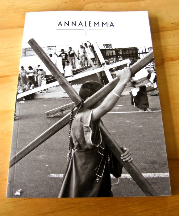
Copyright Annalemma 2009